Photography
Thames riverside B&W: image and thought process
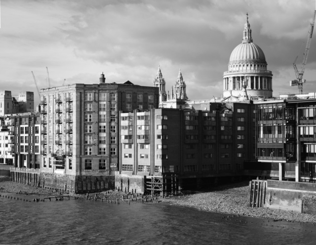
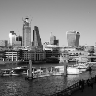
I've been sitting on this photograph for almost a year without sharing or publishing it. It's one of those images that—while I love it—I've always thought I could have done better and came tantalisingly close to doing so on the same day.
The location is about 2 minutes from my office so I've tried a few times to improve on it without coming close to success, and the further I've got from the day, the more I've come to appreciate this image for itself (I usually go the other way with my photographs).
What's the problem?
There's a lot I like about this photograph, so what did I think could be better? Well, I think my root problem was the old pull to try and fit more in an image. It's a classic landscape photography mistake: to take a nice big wide shot of that impressive vista, only to be disappointed when you look on a computer at home and everything feels small and less epic.
Pano problems
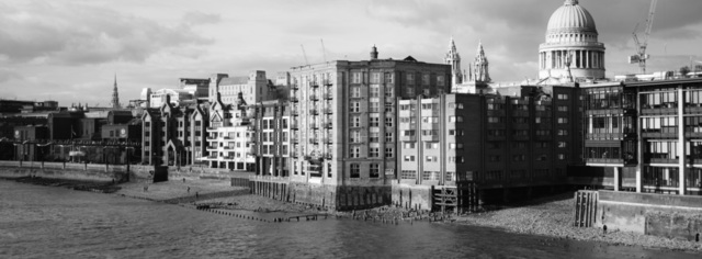
This photograph is a hand-held pano stitch but I'd also done another, much wider, pano pulling in more of the riverside to the left of frame which I really liked. The light on the day was fantastic for black and white, with lots of contrast and the combination of buildings on this stretch of river worked really nicely. There were two problems with the wider shot though: a couple of the frames were blurry (perils of shooting panos hand-held), ruining some details and I missed a portion of the sky in the top left that's needed to included the full height of St Paul's Cathedral (less of an issue thanks to content-aware fill).
Modernity
A year later, these feel quite trivial issues. One other that nagged at me though was the cranes: one right next to St Paul's and another couple poking up out of the roofline. For one thing, they're messy and feel like a distraction in the image. My bigger problem with them though is one that took quite a long time to figure out consciously: they're too modern. I've got a good selection of older architecture here and the cranes throw that off a little. This is clearly silly as there are quite modern buildings on either side too, but perception's a funny thing and black & white processing helps pull attention away from them a little.
Learning to love again
Every now and then, I'd come back to this image in my 'to publish' collection in Lightroom and try to understand what I liked and didn't like about it. Over time, what I decided was that it's the combination of great light and such a low tide, exposing the pebbled shoreline and remnants of old piers and docks. It starts to give more of a feel of the history to London.
Following such a train of thought, the wider shot with many more of the obviously-modern buildings starts to detract from that feeling for me. I still love the wider shot too, and I'll probably go back to it soon and fix the sky (though there's no fixing the blurriness). What I've decided though, is that the smaller, main photograph shared here works well enough and reminds me at least of the feeling I had on the day, which is all that really matters.
I'll still keep an eye out for good conditions and try to improve on this scene in future, but for now I'm happy with what I've got.
