Photography
Whitburn Old Quarry
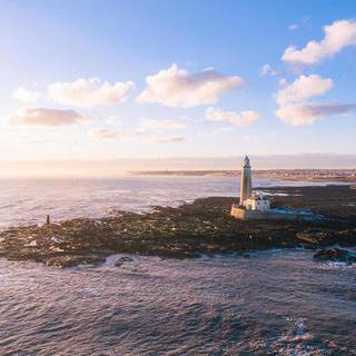
A short walk along the coast from Souter Lighthouse, the cliffs roll down to a small white-pebbled beach: Whitburn Old Quarry.
My dad lived nearby for a couple of years and we used to walk the dog down to this beach and along the beautiful coast path, so it was a nice little trip down memory lane when I visited Souter Lighthouse with my family last year and we took a walk along the cliffs and down to the beach.
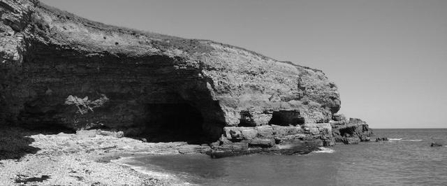
The quarry was a limestone quarry, so the cliffs and rocks are a lovely white-ish colour that feels like you’re somewhere much warmer than the north-east coast of England on a sunny day.
Access to the beach is at one end, while the far end of the beach curves into a small series of caves, I’m guessing created through mining but not sure.
The day we visited was nice and bright, with blue skies which generally suit black and white—especially so with the high contrast of the white rock and harsh shadows. We picked our way around to the caves and arches to see how much we could explore, though it gets steep quickly and with small kids in tow, I didn’t do anything too adventurous.
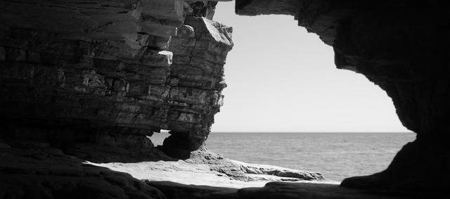
A gentle climb onto a small ledge though, did give me a nice view through the openings in the cliff back out to sea. With the 35/1.4 lens on my X-Pro3, I had to make a quick hand-held panorama in order to get the composition I was after, with the foreground arch in full shade and the rocks further back just side-lit enough to provide some detail.
That you can shoot live in any of Fujifilms excellent camera profiles while still retaining a full raw image makes it so useful for composing black and white images—indeed I often shoot in B&W anyway to focus on the light in a scene without the distraction of colour.
I really like the resulting image: I like that it’s quite hard to tell the scale of the scene (actually relatively small) as well as where it might be. Mostly I like the composition: the shape of the aperture, the balance of highlights and shadows with just enough detail in places to guide the eye.
Two small details I might have changed with a bit more time and attention:
- The much smaller aperture in the rock (lower centre-left) lets the sea show through, but catches the horizon line too, with a tiny patch of bright sky. I’m not sure this is necessarily a bad thing—it shows some continuity from the horizon line in the larger open space—but the balance is a little off and once I noticed it, I keep noticing it. If I went back and made this composition again, I'd try eliminating the horizon and just having the sea show through (raising the camera a little) but also pulling the horizon line down a little, closer to the mid-point of the gap (lowering the camera slightly) to see if the continuation of the straight horizon line does add something.
- At the top edge, in the centre, I’ve just cropped off a bit too much rock, allowing the sky to slightly bleed out of the top of the frame. Practically, this is as simple as being because when I merged to the panorama, there wasn’t enough image further over to the right to crop any higher. Looking back now though, I could crop that little bit higher to fully enclose the arch/aperture and just use a content-aware fill to tidy up what would be a tiny missing triangle of image in deep shadow.
One to go back to some time (as with so many images!) but overall I’m still pleased with what I have here.
